Brand guidelines
How Meetup Hub looks and sounds. Use these when you make posts, flyers or show covers for a meetup. Tap any colour to copy its code.
Logo



- The mark is a coral tile with a hearth brown M. Keep both colours as they are.
- The lettering is always lowercase "meetup hub". Cream on coral or brown, brown on cream.
- Leave space around the logo at least half the tile's width.
- Do not stretch, rotate, outline, add shadows or put it on busy photos.
- In playful graphics the tile may take any stamp ink, except blue on the brown (chocolate) background, which never prints. The COMMUNITY block may still be blue on brown.
- The site header logo rotates through the stamp inks on every page refresh, so a reload always shows a different colour. Each email picks its own logo ink. Neither ever uses blue.
- Never combine it with Whatnot's logo or colours. Meetup Hub is independent of Whatnot.
Core colours
Supporting colours
Signal colours
Only for meaning, never decoration.
Badge colours
Stamp colours
The postage-style stamps on member profiles take one of these seven colours, the same vibrant ramp the activity heat maps use. The colour runs through the frame, the state silhouette and the background finish, while the lettering stays in ink so it reads on every one.
On a map the ramp runs cool to hot as meetups pile up: places with no meetups stay warm cream, then lime through to red. On a profile each stamp takes one ink, chosen from the stamp itself so it never changes between visits.
Typography
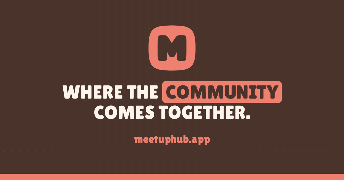
Where the community comes together.
Lilita One: headings, buttons and share graphics.
Find in-person meetups with the sellers and buyers you know from live shows.
Body text: the site's standard sans serif, regular weight.
Headline highlight
WHERE THE COMMUNITY COMES TOGETHER.
Showing coral with warm cream lettering. The home page picks its own ink on every visit.
- One word per headline, never a whole line.
- The block is oversized and rounded, and always sits behind the lettering so the words above and below stay readable.
- Warm cream lettering on coral, red, purple, blue and green; espresso ink on orange, pink and lime. Tap the button to see each pairing.
Voice
- Warm, friendly and plain. Talk like a host welcoming people at the door.
- Say "built for the Whatnot seller community", never anything that suggests Whatnot runs or endorses us.
- Highlight one word in a headline with a rounded block printed in one of the vibrant stamp inks and espresso lettering, like "community". Coral works too, with warm cream lettering.
Share graphics and downloads